It’s time to lower your brand standards
- Sophie Haren
- Apr 23
- 3 min read
Updated: May 4
Okay, so let’s talk about it. The scary thing. The thing no designer wants you to hear:
You need to lower your branding standards.
I know. It sounds dramatic. Sacrilegious. Like I’m telling you to give up and just start posting screenshots of your Notes app in Comic Sans. (Which, to be clear, I would support.) But what I’m actually saying is this:
You’ve been trying to make your branding do something it was never designed to do. You’ve been trying to make it easy. And it’s not. And you keep blaming yourself for that.
But the real problem is the brand you were handed—or pieced together yourself—is like the season two heartthrob on every early 00s teen drama. Mysterious, gorgeous, great in theory…and lets you down on a weekly basis.
I’ve watched so many people pour time, money, and way too many Pinterest boards into “beautiful branding,” only to end up throwing up some random template every single time because they’re exhausted and nothing else ever works.
Because here’s what’s happening behind the scenes:
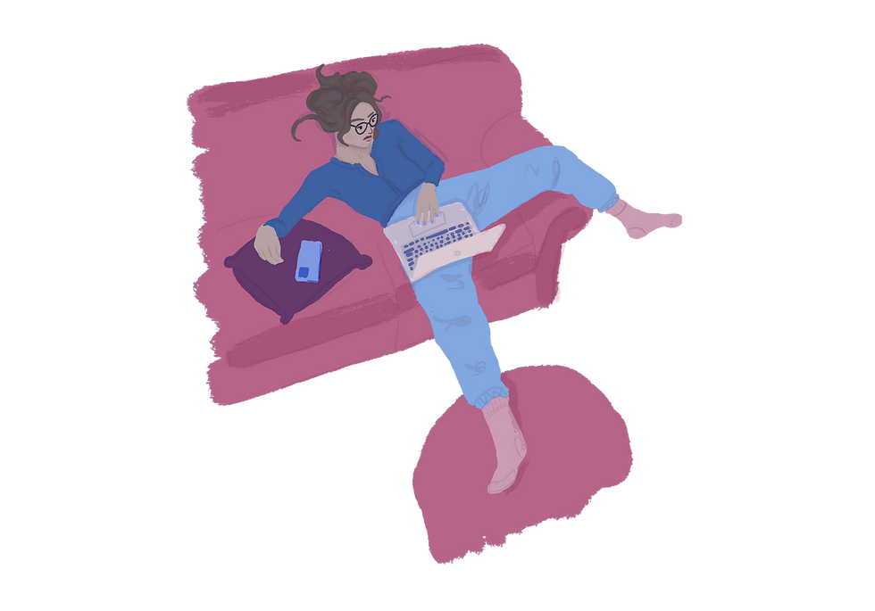
You sit down to create content. You open your brand folder. You look at your templates. And you feel that familiar dread. The fonts are finicky. The layout isn’t built for what you want to say. You don’t have the photos it needs. You start dragging elements around. You question everything. Hours pass. You post it anyway. It feels off. You close your laptop and go lay in a shame coma.
Or maybe that’s just me. (It’s not just me.)
Branding is supposed to make things easier.
But it usually makes everything harder.
And that’s because most of it was never built for function. It was built for _aesthetic._
It was built to impress, not to be used.
So yeah, I’m telling you to lower your standards. Because the standards you’re trying to meet weren’t made for you in the first place.
We’re in an era where video content runs the internet. Your grid doesn’t matter anymore. People want to see _you_—your face, your voice, your POV, your vibe. And if the only thing standing between you and showing up is the fact that your post “doesn’t look good enough”… we’ve got a branding problem.
And let’s be real—you already have enough to do. Running a business is a full-body sport. When you’re not making content, you’re selling, serving, emailing, invoicing, strategizing, launching, people-pleasing, spiraling, recovering, repeating.
You do not have time to spend three hours pixel-f*cking a social post that’s gonna be seen by twelve people and a spam bot at least half the time!
The hustle isn’t holy. The aesthetic isn’t worth it. And you don’t get extra credit for sticking to the exact shade of sage green you chose in 2021.
So we’re doing something else.
We’re going full goblin mode. We’re lowering the bar. We’re making a Thoughtless Brand—a lazy, lovable, functional little system that lets you get in and get out and go live your life.
It’s not ugly. It’s not chaotic. It’s just simple. Its a capsule wardrobe but for your brand. It’s just the shit you’ll actually use.
A logo, a headshot, two fonts, 4 colors, 4 elements, and 4 layouts. That’s it. That’s the base. That’s the version of your brand that you _don’t_ dread using. That you can actually pull out of your back pocket on a random Wednesday and make something that doesn’t suck.
And if that’s all you ever use? That’s fine. That’s enough. But you’ll review and tweak every 90 days to make sure it’s still working for you.
but don’t worry about that right now. Right now, you need less.
So that’s where we’re going. Into the depths of branding minimalism. Into freedom. Into functionality. Into branding that won’t ruin your week.
You don’t need to start over. You just need to go Thoughtless.
And if that makes your eye twitch a little—good. It’s working.


Comments