DEFINE - The Try-Some 16 (YOUR capsule brand)
- Sophie Haren

- Apr 23
- 3 min read
Updated: May 4
If the Reality Check-In was your brand's mirror moment, the Try-Some 16 is your new capsule wardrobe.
The Try-Some 16 is the core of a Thoughtless Brand. It's 16 pre-picked visual elements you'll use across your content—on Instagram, in your proposals, in Canva, in that damn launch deck. You commit to them for 90 days. No tweaking. No spiraling. No new downloads "just in case."
Because a usable brand is one you can show up in on a Monday with zero motivation.
This is your visual uniform. Let's build it.
What Goes in Your Try-Some 16? It's like a capsule wardrobe for your brand
1. The First Four (4 items)
These are the ones you slot in immediately. You already have them, even if they’ve been scattered:
Your logo
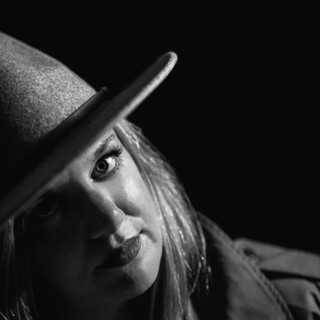
Your headshot (or main brand photo)
Your darkest color (used for things like body text)
Your lightest color (often a background—you’ll use it more than you think)
These are the building blocks. They show up whether you plan for them or not, so commit to the versions that work best.
2. Fonts (2 items)
Just two. One for body copy. One for emphasis (headlines, vibes).
How to choose:
Pick what you already use most often.
Make sure your body font has a decent type family (light, regular, bold, italic).
If your headline font is fun or funky, balance it with something classic.
Skip hard-to-read fonts for main copy—they belong in your Design Elements.
3. Colors (2 items)
How to choose:
Look at what you’re naturally gravitating toward in designs.
Choose for usability and contrast, not Pinterest aesthetics.
You’re allowed to use variations—like lightening the main color for backgrounds—but don’t go darkening or adding a rainbow.
Screenshot your palette, drop it into a black-and-white filter in Canva, and double-check the values. That contrast is what makes stuff legible.
4. Design Elements (4 items)
These are your flavor pieces. Not every graphic needs all four—but your brand should pull from these same buckets.
Options:
Icon or illustration style
Shape (circles, blocks, blobs, pill containers)
Photo treatment (cutouts, stickers, black and white)
Pattern or background texture
How to choose:
Audit what’s already showing up in your graphics.
Think in categories: "scribbly icon set," not "this one arrow."
Store examples in your Living Brand Book so you’re not re-hunting every week.
5. Layouts (4 items)
These are the unsung heroes. Layouts reduce your decision fatigue more than anything else.
Pick the four structures you use most often, like:
* An Instagram carousel format
* A lead magnet or one-pager
* A proposal slide deck structure
* A newsletter layout (intro + bullets + CTA)
Mirrored versions count as one. Stop over-designing—start repeating what actually fits.
Use What Fits. Ignore the Rest.
Your Try-Some 16 isn’t here to max out your potential. It’s here to reduce your energy drain.
If it’s hard to use, it’s out.
If you’re tempted to throw in extras, write them on the Not Now List. That’s where the good ideas go until the 90-day mark rolls around. You’re not deleting—just deferring.
Everything else lives in the vault. That means old templates, cool fonts, pretty colors you never touch. You can go back to them later. But not now.
Once It’s Set, Build It Out
You’ve made your choices. Now make them easy to use:
Create your Canva templates based on your chosen layouts
Plug in the Try-Some 16 across each format you use regularly
Save the files, label them clearly, and don’t touch them unless it’s part of the 90-day edit


Comments